On the occasion of Willem de Kooning: Endless Painting, curated by Cecilia Alemani and comprising paintings from 1944 through 1986 and two sculptures, the Quarterly revisits a conversation between Albert Oehlen and John Corbett from 2013. The pair reflect on de Kooning’s late work and its lasting influence on them.
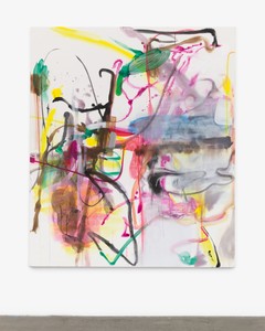
Willem de Kooning, Untitled X, 1985, oil on canvas, 70 × 80 inches (177.8 × 203.2 cm)
Willem de Kooning, Untitled X, 1985, oil on canvas, 70 × 80 inches (177.8 × 203.2 cm)
John Corbett is a writer, curator, and producer based in Chicago. He is co-owner of Corbett vs. Dempsey, an art gallery. Corbett is the author of several books, including Extended Play: Sounding Off from John Cage to Dr. Funkenstein (Duke U. Press, 1994), Microgroove: Forays into Other Music (Duke, 2015), A Listener’s Guide to Free Improvisation (University of Chicago Press, 2016), Vinyl Freak: Love Letters to a Dying Medium (Duke, 2017), and Pick Up the Pieces: Excursions in Seventies Music (University of Chicago, 2019).
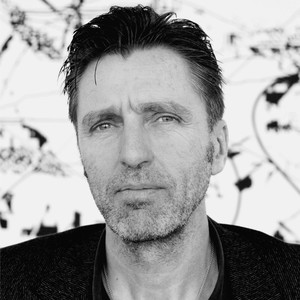
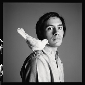
Albert Oehlen’s oeuvre is a testament to the innate freedom of the creative act. Through expressionist brushwork, surrealist methodology, and self-conscious amateurism he engages with the history of abstract painting, pushing the basic components of abstraction to new extremes. Photo: Oliver Schultz-Berndt
John CorbettHow and when did you first find out about Willem de Kooning’s paintings?
Albert OehlenAs soon as I started painting seriously I immediately became very interested. He quickly became my favorite painter, especially the wild paintings with the wide brush from the ’50s and ’60s.
JCHow did you feel about de Kooning’s 1980s paintings when you first saw them, and has your appreciation for them changed since?
AOI remember in ’96 there was a big show of his paintings in Bonn [Willem de Kooning: The Late Paintings, The 1980s], and it completely impressed me; however, it didn’t get much attention. When I heard the response was not overwhelmingly positive, I thought that was impossible, because this work is so great. It was after that when I started thinking more about his work, forming an opinion.
JCIt seems like the general consensus on those paintings has changed pretty dramatically since they were made. When they were made they were initially well received, and afterward there was some feeling that maybe this work represented a weak moment in his career or that maybe his late work would not be remembered as a great ending for him. But it seems that’s been reversed.
AOI hope so, but some people just don’t see it, and they think the late work is graphic, meaning not so much painting. That is wrong.
JCWould you characterize the works as reductive?
AOYes, in a technical sense you can say that because he reduced the fat brushstrokes to thinner lines. But that ignores the important fact that the spaces in between the lines have meaning and that there is a lot of painterly stuff happening in those spaces. There are traces of the work that he kept, so a little bit of color from below seems to shine through the white, and that’s all still there and that’s what gives the painting a sense of volume. I don’t think it’s graphic—in fact, these are just as intense as any works that are covered with brushstrokes.
Willem de Kooning, Untitled XIX, 1984, oil on canvas, 80 × 70 inches (203.2 × 177.8 cm)
What is always very obvious in de Kooning is that he has the gesture, the dynamic of the curves he’s making, his signature.
Albert Oehlen
JCYou’ve spoken about de Kooning’s influence upon your own art-making process. Can you discuss specifically what interests you?
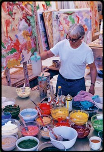
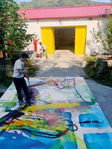
AOAs students, when we were confronted with these wildly intense paintings of his, we were first overwhelmed by their energy and power. It sounds naïve, but we were trying to do something that dealt with that aspect of painting. For me this came to an end almost right away—there was nothing interesting for me to pursue without making the whole process of working more complicated or bringing in other ideas. And then, when I read the biography, I saw how much time he spent developing each painting, which was really interesting for me.
JCNotoriously, he would spend a lot of time looking at each painting while he was working on it, and there are lots of films that feature him making a small gesture and then backing up to spend a long time just looking. Is that something you relate to?
AOI didn’t know that, but I work exactly the same way. I spend my working days mostly on the sofa, just looking. There’s also a story about when he was teaching at Black Mountain College and he had his students work on a single piece of paper for three weeks—now that’s real torture. But that is the essence of painting for me also, to get into that object, into a single painting for a long time and just go deeper and deeper and torture yourself.
JCIs there a specific de Kooning work that is particularly meaningful to you?
AOWell, I have my favorites, and sometimes a favorite is a painting that makes you think the most, and the paintings that are making me think the most at the moment are the late ones.
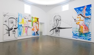
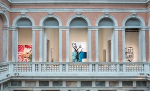
Installation view, Willem de Kooning: Endless Painting, Gagosian, New York, April 15–June 14, 2025
JCDe Kooning went through great transitions in his style throughout his career. You make very distinctive bodies of work that are aesthetically quite different, although of course they have conceptual links. What are your thoughts about de Kooning’s own transition from one style to another and what such radical change might mean to an artist’s practice?
AOFirst, I would say that I don’t really agree with the idea that there was a change of style, because in my eyes he was always interested in the same issues. Of course, you have to make moves as a painter, but these are not consciously different styles. A painter sometimes makes a little step forward, or sideways. Like: “I’ll try this with a brush that is three times as wide as the one that I used before.” Or: “Let’s use thinner paint.” Of course the painting looks different. It’s a new challenge, and you have to solve a couple of problems, and you get a result that looks different. But is that a change of style? I’m not sure. What is always very obvious in de Kooning is that he has the gesture, the dynamic of the curves he’s making, his signature. He has a very significant signature, and it appears throughout his pictures—it’s always the elegant part of his work. It’s beautiful, and it’s his own.
JCWhat you are saying makes perfect sense, because the questions asked by the work might change, but that does not necessarily mean a stylistic shift occurred. The stylistic revisions in his process were based on certain preoccupations, black-and-white versus color.
AOThat’s only part of it. He had several interests. From my perspective he was mostly interested in aspects of representation versus abstraction; in fact, this is where I feel particularly connected to him. He is asking questions like, “How seriously do you take representation? How much do you expect from it? How much do you want it?” In nonfigurative art, there is always a question about where the forms come from. Imagination, a mood, aggression, accident, a plan? Each artist has their own way. In the case of de Kooning, there is always his signature, the gesture of his hand, and there is also a connection to his education as a graphic designer, which included painting typefaces, and that is a very interesting connection for me. The differences in typefaces can be minimal, and there are not many examples in the world where such tiny differences result in such significant changes. Elements of these typeface drawings have become part of his signature. The other thing is the female body. The human eye is trained, conditioned to see differences in appearances, and sometimes the differences are marginal, but that can distinguish between an ugly and a beautiful person. It is very interesting to me that elements of both typography and the human body appear in all of his drawings and paintings. These elements are not just vehicles that he uses to initiate some kind of line, outline, or silhouette. They are not there to be recognized. They create an atmosphere, which reminds me of what I read about James Brown. That before a concert he took a little dose of Viagra.
Installation view, Willem de Kooning: Endless Painting, Gagosian, New York, April 15–June 14, 2025
If the late de Kooning paintings were graphic, then they would be lines on a blank white background, but that is definitely not the case. These lines are outlines of an imaginary volume, a body or something, an object, a girl.
Albert Oehlen
JCSpace, in particular white space or blank canvas, is important to your work, much as it was in de Kooning’s later paintings, when he added increasing amounts of white to his compositions. Do you see a connection?
AOIn my earlier paintings I covered the entire canvas with paint, because the goal was to make paintings that were immediately recognizable as wanting to be traditional paintings and needing to be seen in that context. As such, they had to be heavy-handed, and every inch needed to be full of paint. That’s the first ingredient of needing to prove something, feeling an urgency to say something, but once you’ve done that enough, then you might as well make a change. And that is how my work went from dense compositions to spare compositions, from no background to white background. It has nothing to do with influence, though; it’s simply a matter of not wanting to paint the same your whole life. You can paint thick for a while, and then you come to a moment where you move from thick to thin. It’s that easy.
JCSo each of these changes presents you with new challenges, new problems to solve. How does the problem, or in particular the issue of leaving space in a composition, change what you have to think about when you’re working?
AOWell, for me this move to the white background just happened, and it was easier than before—it felt natural. I just wanted to try it. I wanted things to be lighter; I wanted a friendlier painting.
JCIn this context, it would be interesting for you to elaborate further on the idea that the white space on these de Kooning paintings holds meaning. In particular, it seems to be one of the things that you’re paying attention to when you are making paintings that have less, and yet when you look at de Kooning, it’s the same.
AOIf the late de Kooning paintings were graphic, then they would be lines on a blank white background, but that is definitely not the case. These lines are outlines of an imaginary volume, a body or something, an object, a girl. And if you follow these lines, some of them have not only one job, like you can say in this part there’s something on the right and a void is on the left, but on the other end of the line it could change its meaning and the body could exist on the other side. And that means that the whole thing is like a Cubist painting. It holds a lot of volumes, a lot of bodies start looking at you, and the picture gets depth. You can dive into the painting, which you couldn’t do with a graphic painting.
John Corbett is a writer, curator, and producer based in Chicago. He is co-owner of Corbett vs. Dempsey, an art gallery. Corbett is the author of several books, including Extended Play: Sounding Off from John Cage to Dr. Funkenstein (Duke U. Press, 1994), Microgroove: Forays into Other Music (Duke, 2015), A Listener’s Guide to Free Improvisation (University of Chicago Press, 2016), Vinyl Freak: Love Letters to a Dying Medium (Duke, 2017), and Pick Up the Pieces: Excursions in Seventies Music (University of Chicago, 2019).
Albert Oehlen’s oeuvre is a testament to the innate freedom of the creative act. Through expressionist brushwork, surrealist methodology, and self-conscious amateurism he engages with the history of abstract painting, pushing the basic components of abstraction to new extremes. Photo: Oliver Schultz-Berndt